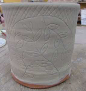
The photo below shows a cup with my clear glaze applied. Since the clear goes on in a thin coat and doesn't contain any oxides or stains I can easily see the sgraffito drawing under the glaze. That is nice if I am going to come back on top of the glaze with another glaze to color the leaves or birds or whatever. (Which I did, but didn't take a picture).

The next image shows the new honey glaze which now has 4.5% burnt umber in it. I feel like this glaze needs to go on thicker. If the glaze is too thin the color will not be right. I dipped the first cup( no image) and could not see the drawing on the pot. Oops. So I thinned out the glaze a bit so that I got this result on the second cup.

The imagery showed up fairly well as the glaze dried and I was able to go in and add some green glaze on the leaves. I won't know until after the firing if this is thick enough for the burnt umber to give me the honey color I want.
This got me wondering if makers in the past had this same issue. I have seen historical pots where the green glaze seems to be applied in a hit or miss fashion.
Example HereAlthough after looking at more pots from this same period I think the green was applied with the intention of adding another color, not necessarily highlighting the foliage or other parts of the image.
See
Here and
Here.
I think this pot would have benefited from George holding off on the green.
Click.Other times the glazes are applied quite nicely.
Here and
Here.
This pot is one of my favorites at the moment. I plan on making some jars this week. Look for that shape to show up.
If you're going to NCECA this year you'd better get over to the Philadelphia Museum of Art to see some of these pots.


